éclaireur de changement, Peter Zimmermann est livré à la compréhension de son public par ce très beau texte de Markus Mascher, conservateur du Leopold-Hoesch-Museum à Düren (Allemagne).
(texte en anglais)
pathfinder
From World Atlas to Mobile App
What does it mean when Peter Zimmermann transfers the visuality of a digital application to an analogue image? What does it mean for our comprehension of an image? What does it mean for our notion concerning the definition of an artwork? In addition, what does it mean for our considerations concerning what we regard as reality?
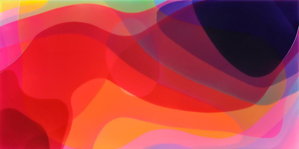
In developing his most recent works, Peter Zimmermann has employed an app, which can be used to defamiliarize one’s own digital photographs or images fished from the internet, reworking them in the Impressionist manner. The use of this style’s artistic criteria, especially the activation of light’s modulating effect, is paradoxical when applied to digital pictures to the extent that such images in any case fundamentally concern coloured pixelated light. Its precision, sharpness and granularity are now so advanced that it surpasses by far natural sight and its relational as well as proportional boundaries. In this respect, the use of such an instrument to generate never-before-seen images is indeed consequent. Throughout his artistic career, Peter Zimmermann developed his themes by exploring conventional forms of communication and intuition of the world. In the process, he never abandoned the tie to a motif. However, he quickly distanced himself from recognisability in the sense of identification with an object known from everyday experience existing outside the image in order to refine his pictorial inventions based on other visual references. It is this occupation with the digitally generated image, omnipresent in our environment as a private practice as well as a professional product, that is a central artistic urge for Peter Zimmermann. It serves him as a means to develop pictorial motifs that seem eminently important to him and are realised in the form of an analogue artefact that is hence unique in its physical existence.
He has carried out his most recent works in oil, producing a tactile object through the manner of his brushstroke. Its physical properties are just as important as its visual appearance. The viewer is offered a tonally modulated colour scheme whose imagery appears abstract but simultaneously reveals a separate pictorial intrinsicality. Dynamism is inherent to the individual paratactic as well as intertwined constellations whose application of paint has recently varied also dimensionally, from which the picture seems to solely convey a frozen moment. Its effect is by all means a consequence of a classic interpretive approach as regards the image, a viewpoint that presupposes the recognisability of an external given. The artist paraphrases here the coalescence of an impulse that is triggered quasi automatically during the consumption of any type of picture, recognisability, with an interest for a painterly object whose autonomous existence and contentual Hermeticism is irrefutable.
The widespread consumption of images that, as the filmmaker Edgar Reitz recently observed*, no longer differentiates between natural and media-conveyed sight, is interesting for Peter Zimmermann as a means of enabling new visual experiences and thus also differentiated perceptual experiences relative to the world. The most recent oil paintings are meticulously prepared in the studio with a colour analysis encompassing the production of sample cards with specific colour designations that are then drawn upon to develop the gradual course of colour or the contrasting colour encounter. Its construction is an undulation of depth and plane, a concentration of varyingly dimensioned brushstrokes and their coloured edges. The brilliance and material presence take advantage of the solidity of the hardboard support. In the case of his immediately preceding works, which were painted in oil on canvas, the textile support on which the coloured passages proceed from bright colour modulations as well as the dimensional unification of the individual brushstrokes make a more organic impression, which, however, one should not be fooled by because the motival models have been generated on a computer monitor. This is suggested by a title (…) in which harmonious as well as contrasting colour constellations are supposedly arranged as equals adjacent to each other for testing purposes, thus achieving pictorial worthiness.
*Edgar Reitz, ‘Augen auf’, in Süddeutsche Zeitung, No. 188, 16 August 2019, p. 5.
With the use of oils, Peter Zimmermann returns to the beginnings of his artistic development. The first works were likewise painted in oil on canvas. As could conceivably be assumed, in no way did this correspond to the consequences of artistic convention but was founded rather in the motifs he selected for his artistic practice in the mid 1980s. It involved book covers whose then still mechanical making with embossed title in the cloth binding finds itself in the artistic paraphrase. It was the dimensional shifting that accompanied the translation of the motif into an oil painting that brought the works into a striking difference to their motival models. A striking example of this can be seen in a key work from this phase of the artist’s career, the three-metre high Diercke Weltatlas [Diercke World Atlas].
Peter Zimmermann began his artistic career at a time when painting increasingly regained relevance, returning to the art theoretical discourse both as an artistic theme and as a medium. However, while proponents of the so-called “Neue Wilde” or the Bad Painting of Martin Kippenberger and Albert Oehlen that saw itself in the tradition of the 1978 New York exhibition of the same name focused attention on the claim to artistic individuality and the painterly gesture by way of the deliberately brought about disruptive moment, Peter Zimmermann was producing oil paintings based on a selection of graphically interesting book covers. The adaption of the motif was realised as a frontal view with the borders of the object aligned with the edges of the painting.
Instead of aiming at shaping a personal gestural style, the artist reduced his artistic impulse down to the would-be adaption of the motif’s visual given. He created an unmistakable style in this way and formulated a credo for his artistic production. By transferring the visual appearance of the mass information and communications medium book to the status of a respective unique item, he made an important commentary on the vehemently accelerated information and consumer society that increasingly marginalised the significance of the original within the art scene subsequent to Pop Art and Conceptual Art. Peter Zimmermann drew upon experiences from his immediate surroundings. Like most of his contemporaries (as well the successive generation of students), he explored the world through the classic Diercke Weltatlas, and in 1990 a New York City travel guide likewise represented a great promise for most people.
The fact that an interest in graphically sophisticated book cover design solutions represented a criterion for the motif selection, and not solely the associated content, becomes evident through the adaption of titles like Der Precis or Rationelle Fertigungsvorbereitung. In technical terms, however, Peter Zimmermann soon switched from the classic oil paints to epoxy resins that, thickly applied and brought into form and position, congealed into a precise motif. According to the artist, of decisive importance was the aspect of the reflecting cellophane foil in which books were wrapped. But just as significant was the artistically attractive relief character resulting from the adjacency of the differently coloured layers of epoxy resin on the canvas. They made the previously painted support material of the canvas into an integral component of the wall object painting. The crucial difference in the pictorial approach is evident in a comparison between one of the “Polyglott” travel guide covers in the serial format of 80 x 48 centimetres – of which there are a number of destinations, first German, then European and finally international analogy to the series character of their then publication – with the larger “Polyglott” travel guide cover Südschwarzwald, with which the artist honoured his native region, simultaneously sealing the pictorial object through the all-around application of identically coloured layer of epoxy resin, thus auraticising it to a certain extent. It is hence probably not a coincidence that the only motif Peter Zimmermann selected from the legendary “edition suhrkamp” series designed by Willy Fleckhaus was Walter Benjamin’s essay Das Kunstwerk im Zeitalter seiner technischen Reproduzierbarkeit [The Work of Art in the Age of Mechanical Reproduction], a crucial text in the formulation of the essence of a work of art*. As the extensive group ofw orks based on the “Polyglott” travelguides documents, this is all the more remarkable as that the serial aspect of book series by all means seemed to be of creative significance for the young artist.
*Benjamin detected the loss of the artwork’s aura and the transformation of its social function, deducing from this the decreasing relevance of conventional artworks for modern society as opposed to the development and dissemination of the reproductive mediums of photography and (sound) film. Walter Benjamin, The Work of Art in the Age of Mechanical Reproduction (London, 2008).
Parallel to the diversification of the artistic techniques employed by Peter Zimmermann, he increasingly distances himself from the identification of the pictorial motif with a recognisable source and develops new creative possibilities. Das Kunstwerk im Zeitalter seiner technischen Reproduzierbarkeit after Benjamin was already one of the last of its type in 1996, and in fact the strict graphical design of the source evades the impression of exact imitation through a shrouding artistic realisation in epoxy resin (incidentally the volumes of the “edition suhrkamp” were never wrapped in cellophane) while amorphic motifs as heralded for example in the series of artworks on Jackson Pollock from 1998/1999 not only enabled but also required a free painterly development. It is a challenge that Peter Zimmermann eagerly accepted in subsequent years*.
*The reference to a pioneer of Abstract Expressionism is of interest here. Pollock explored the painterly potentials of his material with a view to the autonomisation of painting. While Peter Zimmermann evaluates the insights for the painting process resulting from this for his own work, he simultaneously implies the significance of an underlying motif for his paintings.
In the process, the graphic quality of the selected source image remains determinative for the experimental occupation with his material, both from an aesthetic and a technical perspective. It is not far removed from a motif like the special effects – an expressive picture title for Peter Zimmermann’s unorthodox approach to his themes. At the same time it also honours an era of analogue graphic design that is coming to an end with the dissemination of the PC – the flowing, hi-gloss and reflective picture surfaces that successfully hinder the recognisability of a motif through pixelising, distortion and blurring effects, triggering at the same time the key stimulus of recognisability, of identification with something already once seen. From this position, the contents previously enclosed in the rectangle of the picture soon extended out into the free scope of artist and viewer by means of all-over and site-specific wall and floor pieces. (The latter incorporate the visitor more comprehensively than the large- format paintings to the extent that they are usually accessible.) In conjunction with this expansion sequence, the sticker works regularly recur in situational contexts. Peter Zimmermann composes an identical picture motif that he previously generated digitally as a potentially infinite number of wall fields that do not deny the continuous series character of the motif but which in its overall view leaves the impression of a pictorial trace, a dynamic imprint on the wall’s surface: a rally stripe for the constructed space as a tuning of its dimensional characteristics.
The use of the airbrush technique, which Peter Zimmermann integrated at some point into his painting with epoxy resins, fits in well with this. The visual overview thus exponentiates itself into a seemingly spatial, albeit completely abstract picture as regards motif. As can be seen in the late paintings of Piet Mondrian, whose role as a referential figure for Peter Zimmermann is documented in two book cover motifs from 1995, the actual overlapping of layers of paint – in the case of Peter Zimmermann’s works they are coloured tracks, overlaid with translucent epoxy – generates a spatial illusion that is not only accepted as a legitimate pictorial effect but also deliberately brought about and activated.
This opened up a completely new dimension of artistic possibilities of expression for Peter Zimmermann. In the meanwhile, the computer monitor and lately the smartphone interface as membranes between the virtual world long seen as real and the analogue reality of artistic production is just as much an impulse and instrument as well as an theme for Peter Zimmermann. The physical intangibility of digital images provokes his urge to manifest a potentially homogeneous effect in an auratic object. A monumental picture like monitore documents the fascination and the magical potential located beyond this membrane. Black and impenetrable in sleep mode, the monitor opens up a view of the world upon activation that is not only responsive but also reassorts the categories of imagery. The overlapping of the dark, hermetically smooth and reflective layers of epoxy resin and their suggestive transitions to areas of brightly primed canvas and zones of sprayed courses of colour become a pictorial complex that again emphasises the physicality of its existence, is overpowering in its dimensions and simultaneously leads its efficacy to the edges of objectness in both a material as well as a contentual sense.
Iconographically, paintings like monitore from 2007, but also in those from the 2010 portrait series or magazin and phone from the most recent group of works, cannot be distinguished between defined pictorial body, visual effect and contentual significance. The productive borderline experience denoting the determination of a format and the composition of the defined course and behaviour of form and colour on it can be found throughout Peter Zimmermann’s most recent series of works. The newest paintings comprising layers of epoxy resin on canvas make use of the striking silhouette of the modern smartphone. A majority of them show this form sectioned and gradually stagger the individual layers (both factually as well as) in monochromaticity. The diverse concentrations and constellations of the overlappings as well as the relationship between the effect of translucent and opaque surface activate the pictorial occurrence. A remarkable analogy exists between the current epoxy resin pictures and the paintings that paraphrase brushstrokes, which also appear as undulating surfaces and seem like the snapshot of a motion sequence. While parataxis makes up the decisive design principle of the brush tracks, in the case of the iPhone silhouettes it is the overlapping of translucent layers of paint that more or less suggest corporeality based on their colourful intensity, thus effecting a relational development of depth. This principle was already acted out in the portrait series from 2010, albeit in combination with a sprayed application of colour. Dark layers of epoxy resin are arranged on top of each other in such a way that an indication of colour seems to be a component of the resin body at the edges, allowing one to arrive at a different perception of its substantiality. The work magazin likewise adopts this principle with a lucid use of colour that gives rise to another atmospheric effect and ties onto earlier abstract works.
The imaging-related question concerning the relationship between object edges and motif disposition is a consistent feature and of central importance for Peter Zimmermann’s work. The book cover paintings from the 1980s and 1990s already identify the boundaries of the motifs with the edges of the object. In his successive resultant artistic examination of what abstract painting can be today, thus question naturally intensifies into an elementary one and can also culminate in the confrontation between object boundary and motif constellation as is the case in the floors whose expanse must orient itself on the architectural givens, revealing, however, a contrary motif in terms of form*.
*Peter Zimmermann has practiced this in all consequence at his Schule von Freiburg exhibition in which an allover-incorporated floor completely took up all the exhibition spaces and a motival continuum ignored their structural givens.
The artist presently seems to want again to intensely explore these variations. As a post- modern artist who conceptually as well as procedurally has no reservations about artistically unexplored terrain while simultaneously insisting on the originality of the unique work of art*, he takes advantage of the availability and easy handling of coloured transparent foil in order to act out the possibilities in the small format of the artistic study that result from this definition of the pictorial space.
On a uniformly formatted white picture field, Peter Zimmermann applies coloured constellations within a uniform white edge, the forms of which relate to each other based on diverse parameters. There are monochrome conglomerates produced from iPhone silhouettes that correlate in their different denseness with the most recent epoxy resin paintings. There are complexes of colour and form that hover autonomously and hermetically on the white picture field. There are overlappings and the resultant colour findings that completely take in the defined picture space and circumvent an unambiguous inner spatial classification. And there are the paintings that evoke spatial structures that enter into a relationship with the white of the picture field through the inclusion of it.
It is an open space of possibilities for the seeker Peter Zimmermann who defines himself by way of the pronounced interest in colour and opens up its surface effect, thus connecting the diverse, in part simultaneously produced groups of works. Similar to the resonance space that was once the Diercke Weltatlas and later were the computer monitor and smartphone surface, potential approaches to a work crystallise from the small-format foil pieces. That these stand in their own respective work tradition, designating the abstract as the new concrete, thus winning aura as physical object to the extent that it does not conceal the duality of its production und its efficacy but exhibits and addresses it, is an integral characteristic of Peter Zimmermann’s artistic positings that demands, enables and qualifies personal experience and personal sight on the part of the producer as well as the viewer.
*On the concept of the original see also Benjamin 2008 (see note 2), pp. 5ff.
